Hadleigh Waldegrave's portfolio
A no-frills presentation of my expertise, last updated in 2022.
Get in touch for more recent work, and details I can't disclose here.
- Project mgmt.
- UX
- Analytics
- Dev
- Design
- Coaching
- Optimisation
- SEO
- Strategy / IP
- Reporting
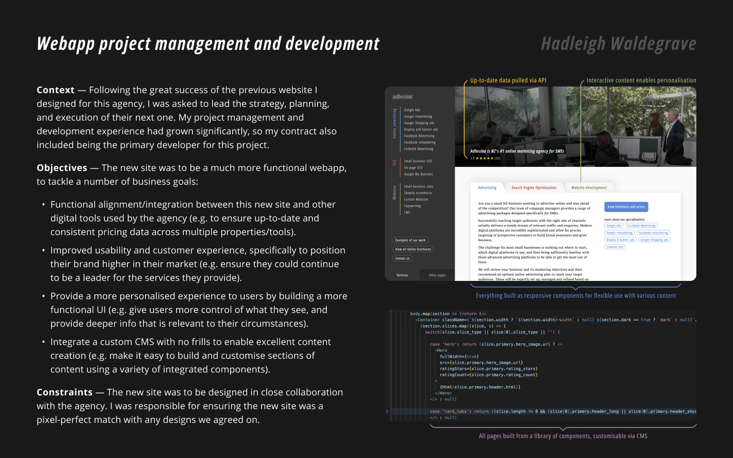
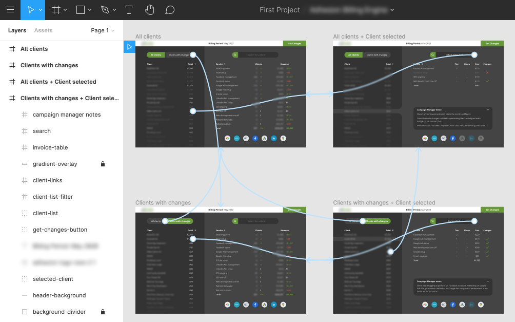
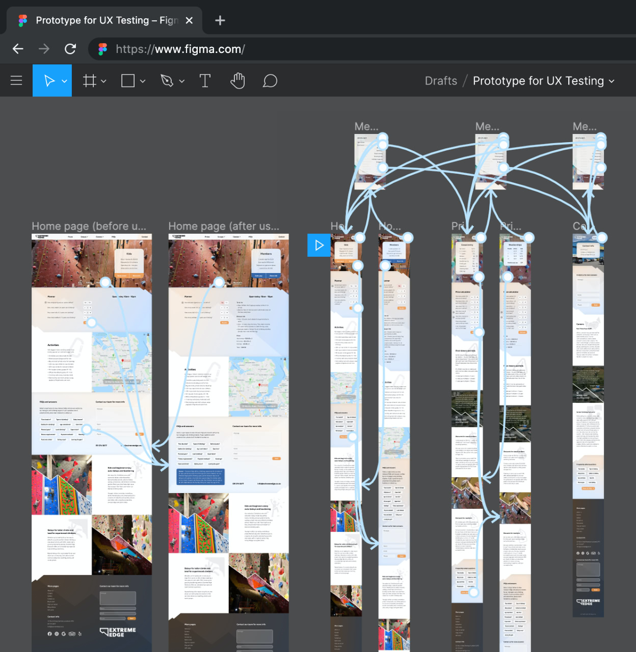
Custom webapp project management and development
This project was a significant undertaking, requiring collaboration with the business' director, senior developer, content creator and SEO specialist to develop strategies and plans. I was responsible for the analytics, design and development of a highly-customised webapp and CMS. I was also deeply involved in both the high-level decision making and front-line execution, requiring me to jump between commercial/UX/technical mindsets, and apply my cross-functional skills to knit together win-win solutions.
At the time of writing this portfolio piece, the business is currently refining the content ahead of launch, so there is no way for me to report on ROI-related performance. However, as the presentation (right) covers, I succeeded in delivering on many of the business objectives defined for this project (listed on page 1). We have done some pre-launch testing, and I can confirm that the new site passes standard SEO and page-speed benchmarks with flying colours.
There is not much more I can say that isn't covered in the presentation (right). I put a lot of effort into it so I encourage you to view the full-size version. If you have any questions about this project, please reach out to me. I absolutely loved this project and I'd be more than happy to discuss.
Responsibilities: Project management • Webapp development • CMS development • Strategy and planning • Custom analytics • Data visualisation • Iterative design • Algorithm design • Employee training • Cross-functional workshopping
Presentation: A detailed summary of the planning and delivery of a highly-customised webapp and CMS, built on a state-of-the-art tech stack.
2022
Digital maturity, structure, research and transformation
This PDF (right) tells the story of my journey with an undisclosed company, gaining trust and working on increasingly high-level initiatives. Page 3 introduces a high-value project I drove, with the goal of improving the company's digital capabilities, efficiency and value-delivery. It primarily involved conducting thorough research and analysis to understand their resources, map out their systems (humans + software), and building a roadmap for implementing change.
Pages 4 and 5 visualise some of the framework that was developed. This involved a lot of sensitive information and valuable IP, so parts have been blurred out, but enough has been preserved to illustrate the depth and rigor of the work involved. Page 3 also includes a list of my responsibilities for this project (e.g. using analysis/algorithms to translate qualitative learnings into datapoints, then aggregating and presenting them in meaningful ways).
This project was seriously challenging in ways I loved. The only way to solve problems, mitigate risks and deliver appropriate solutions was to dive in deep with empathy and diligence. I had to flex my systems thinking muscles at every level to ensure we arrived at an agile direction that wouldn't unnecessarily disrupt their teams. This project demanded applying 'agile' as a frame of thinking that was clearly articulated (i.e. the opposite would be a 'one-size-fits-all prescription').
Although I don't disclose exact details, I found a number of instances where a lack of effective cross-functional collaboration was resulting in inefficiencies and the over-prioritisation of work that was low-risk/low-reward. It has been my (personal) experience that most businesses have (understandably) not found a way to facilitate cross-functional workflows, or have tried without implementing incentives that uphold the quality of work. We were careful to ensure that the solutions we proposed (not disclosed) baked in incentives to prevent pace/scale being over-prioritised before quality was improved and maintained.
Responsibilities: Project management • Employee interviews • Efficiency optimisation • Agile coaching • Algorithm design • Data visualisation • IP development • Digital maturisation • Cross-functional collaboration • Relationship management

PDF: Summary of increasingly complex work I did for an undisclosed company, including a high-value digital management/transformation project (pages 3-5).
© Havas Helia Ltd, 2021
Optimisation program management and case study
20x ROI, +86% funnel volume, +47% conversion, -58% bounce, +14% engagement, 99% significance
Although this case study highlights a 'unicorn' A/B test result, there was a lot of work leading up to it that was very enabling and insightful. The new design focused on making users feel like they would have more control over their conversion experience.
Users were looking for a fund-management service, but this type of service can be configured in dozens of different ways. Although the business viewed it as one service, from their users' perspective, it was lots of similar services. Users wanted to ensure they would be getting the right one for them, but it didn't feel like they had a choice until after commiting to converting. The PDF to the right illustrates how we addressed this, and the changes we tested.
The solution we delivered was a result of the careful planning, management and execution of an ongoing optimisation program. We implemented custom 'active engagement' tracking to more deeply understand how people looked for various pieces of information. This effectively provided a highly-segmentable 'heatmap' that, instead of focusing on users' scrolling and mouse-movement behaviour, highlighted where users focused their efforts (e.g. engaging/disengaging with content throughout the funnel).
We setup the program to facilitate continuous learning, including deep reporting to establish insightful dialog with stakeholders. This was important for growing executive buy-in so that we could shift away from standard metrics and KPIs, in favour of measures that more closely reflected their business objectives (e.g. their team valued UX improvements but weren't able to measure changes quickly and at scale, so it was hard to prioritise). This was also important for building digital maturity and cultivating an environment where teams could work beyond their typical comfort zones.
Responsibilities: Program management • Custom analytics • Quantitative analysis • Stakeholder management • Prototyping • Test creation • Reporting • Relationship management • Technical writing • Case study creation
Tools: Optimize • Data Studio • GTM • GA • Figma • Google Slides • Google Docs
Case study: Overview of an optimisation program I managed that produced novel insights and high-value tests.
© Havas Helia Ltd, 2022
Converting low-budget ideas into high-value results
+39% product views, +69% payments, +76% mobile revenue, +18% total revenue, 95% significance
Having learned from running 3 in-depth experiments, I wanted to question two assumptions: First, significant changes in design are necessary for causing significant changes in performance (especially for webapps with low traffic that limits our ability to detect changes in performance). Second, the majority of revenue for this business is (and therefore 'should') be driven by desktop users, simply because the experience is evidently more suited to larger displays.
Through thorough analysis, I identified a change that required little effort to implement, yet should make a big impact on user behaviour. We changed the layout of the mobile navigation in a way that leveraged the 'Principal of Reciprocity' (explained in the case study). Users spent more time browsing free content and, in response, were more open to being suggested to check out the business' premium content (due to the new layout of the mobile navigation).
This test shifted the main driver of conversions from desktop users to mobile users, and provided deeper evidence that there was more untapped potential to be gained from areas that were previously overlooked.
It's important to note that this was an unusually positive result. For any business, only a small percentage of ideas have the potential to disproportionately move the needle. However, we worked diligently to follow a process that allowed me to identify one such idea early on. Given our initial budget constraints, the true success here was rapidly proving the effectiveness of our agile process. This grew executive buy-in, relationship trust, employee motivation, and the overall potential of the digital program I was managing.
Responsibilities: Program management • Relationship building • Articulating technicalities • Requirement prioritisation • UX design • Behavioural analysis
Case study: Summarises how my team delivered a simple solution that drove a disproportional uplift in revenue.
© Havas Helia Ltd, 2021
Custom tracking for generating insights and validating results
Our custom metric was the most reliable predictor of conversions across 8 designs
This meta-analysis is the capstone of 6 months of work, including comparisons across 4 experiments. It evaluates the effectiveness of our custom 'engagement' metric as a relatively reliable predictor of conversions, and a more meaningful metric for generating deeper insights. It also describes how we defined and tracked 'active engagement time' (segmented by sections of content, pages, etc). For this study, we kept it relatively simple — I have since developed better versions that are much more sophisticated, but still use 'seconds' as their base unit (to ensure analysis and findings are relatively easy to understand).
All 4 experiments involved a new design that significantly out-performed the original design (to help keep statistical comparisons consistent). We tracked and analysed a wide array of standard metrics, including a conversion metric (+21% median increase) and a micro-conversion metric (+23% median increase). We wanted to understand what metrics correlated with each other consistently (i.e. across a variety of contexts), including our custom engagement metric.
The experiments and data I used were a result of building trusting relationships with digital managers of a variety of large brands that operate in NZ and internationally. Our success required a lot of collaboration that was fast-paced and cross-functional. This was a great exercise in questioning assumptions to upgrade our toolbox of useful metrics for decision-making.
Responsibilities: IP development • Algorithm design • Relationship management • Custom analytics • Experimentation • Multi-study analysis • Project management • Reporting • Cross-functional collaboration
Tools: VWO • Optimizely • Google Optimize • VS Code • JavaScript • GTM • Google Analytics • Figma • Excel
Meta-analysis: Summarises and compares the results of 4 A/B tests, and evaluates the performance of our custom tracking.
© Havas Helia Ltd, 2022
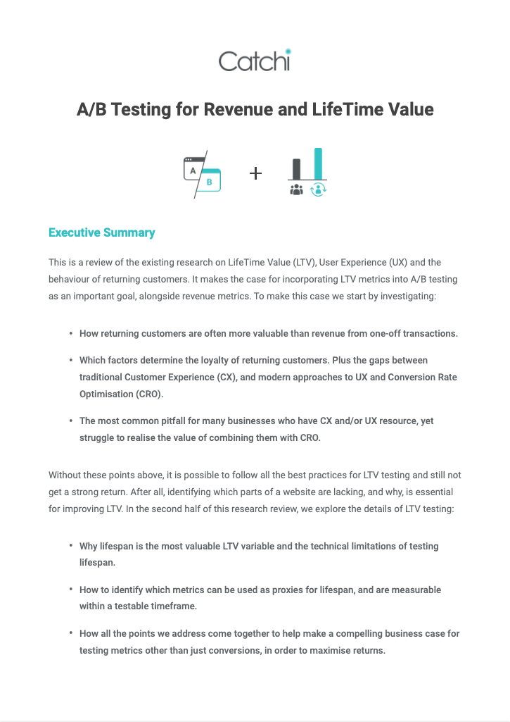
LTV research and white paper publication
This white paper summarises 3 months of extensive research, sparked by a problem that almost every business (understandbly) has: Qualitative research is expensive to scale, and quantitative testing is biased towards short-term metrics that are easy to measure. Very few businesses I've worked with have been able to implement some change and verifiably measure how it affected their average customer lifetime value (LTV).
I worked with a variety of businesses to enable them to be able to measure LTV, and improve their ability to predict changes in LTV. Being able to predict changes in LTV is important because when businesses implement some change, the full effect of that change is usually takes a long time to be seen. This is especially important when the buying-cycle for a business' typical customer is several weeks, months or longer.
The white paper uses evidence to build the case that optimising for the long-term value of returning customers offers significantly higher returns (on average) than optimising for conversion rate and/or transaction value. It aggregates research to clarify what short-term factors have the biggest affect on customers' loyalty and re-purchasing behaviours. Finally, it describes how these short-term factors can be incorporated into analytics and tests in order to indirectly optimise for long-term factors (e.g. LTV).
I enjoyed this research project because it makes a strong argument for businesses to build their digital maturity, question how they attribute risk/reward, and facilitate innovation. The businesses I worked with during this time began shifting their default mode of thinking from "If the potential benefits of an idea are hard to quantify, then it is risky" towards also considering "If we only work on ideas whose benefits are easy to quantify, then we are at risk". This often resulted in allocating less resource towards over-optimising things that slightly move the needle, and a bit more resource towards realising a more valuable product vision.
Responsibilities: Multi-project management • Primary research • 3rd party research • Content creation • Publication writing • Iterative reviews
White paper: Summarises extensive research of LTV metrics and correlations, and builds a compelling story around optimising drivers of long-term value by enabling a 'data-informed' culture.
© Havas Helia Ltd, 2022
Transformation and thought-leadership for a global brand
My presentation (right) was used to help kick off a global ecommerce brand's transformation towards becoming more digitally capable and data-driven. It was delivered to executives, senior managers, and their teams to provide a strategic direction, along with a variety of statistics and learnings to help them align around the vision that was being conveyed throughout the global meeting. This meeting was part of a larger initiative that my team helped work towards, in tandem with their global head of ecommerce.
For intellectual property reasons, much of the presentation has been blurred out. After introductions are made, it begins to 'lead by example' by showcasing some of the work my team had recently delivered, along with inspiring results and learnings. It then surfaces on a variety of unresolved problems, potential opportunities, and warnings and best practices for addressing them. It wraps up by covering a number of principals for their teams to leverage over the upcoming business quarters.
This presentation is an example of the ongoing consulting and training I provided while working with a variety of businesses owners, directors, and managers. Over this time, I focused on distilling my technical knowledge, developing compelling stories around strategic direction, and articulating solutions to 'sticky' problems in ways that resonated with stakeholders.
Responsibilities: Consulting • Presentations • Training • Thought leadership • Digital transformation • Story telling • Cross-functional facilitation
Presentation: Delivered at a global meeting as part of a wider digital transformation initative.
© Havas Helia Ltd, 2021
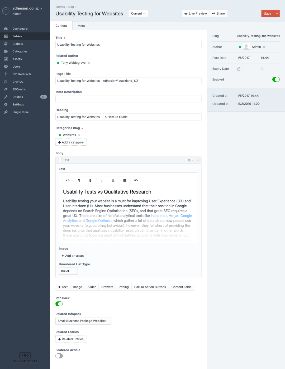
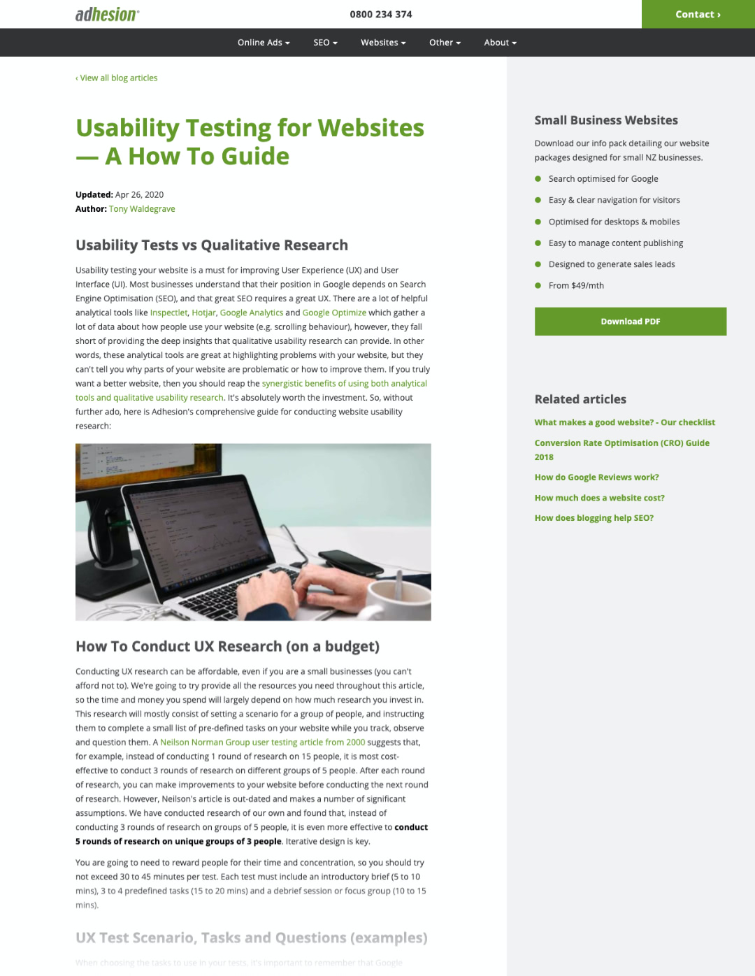
Web development for UX and CRO
+17% leads, +23% mobile users, +17% faster
I was tasked with re-designing and developing Adhesion's site to improve user experience, conversions and perceptions of trust with the brand. To experience the improvement yourself, you can visit the old Adhesion website and the new Adhesion website.
Everything was conceptualised, tested, and then developed in a way that employees could easily create new webpages (with a good amount of design and layout flexibility). I templated the logic and design of various elements so that employees could essentially drag-and-drop elements in whatever order suited their content.
These elements also included different types of related content that could be used to populate the greyed-out column on the right-hand side (e.g. brochure downloads, related webpages, Google reviews, etc). This column was particularly important for reducing the paragraph width on large displays, making content easier to read.
A significant amount of work went into the top navigation, above-the-fold content, and the footer which dynamically displays relevant content. There is too much to cover here, but everything you see has been carefully considered, so feel free to ask me about anything!
Tools: Photoshop, Sketch, Craft CMS, Twig (templating language), Transmit FTP.
© Adhesion, Ltd.
Review of UX research and usability testing
Having read dozens and dozens of books, expert reviews, reports and peer-reviewed publications on UX research, I found myself dissatisfied with the countless short-form and/or misleading articles on UX research and A/B testing. I decided to do my part by writing a comprehensive review about UX research and usability testing that compiled evidence to address the many questions and controversies found in online discussions (this review has recently been un-published as it is being updated for re-publishing — I cannot provide a link to it at this time).
In about 4,000 words, broken into digestable sections, this review covers seven key areas: (1) What distinguishes good UX researchers from others; (2) How mnay participants and rounds of testing are optimal in various contexts; (3) The 'battle' between quantitative tools and qualitative research; (4) How statistical significance is different for A/B testing versus usability research; (5) Typical budget requirements for various businesses; (6) The average ROI for usability testing in various contexts; and (7) How to effectively integrate business processes, agile workflows and UX research.
This project was a long journey as it incorporated 3+ months of thorough research and vetting to incorporate only high-quality evidence/studies. I learned a lot, questioned a lot of my assumptions and revealed some of my own biases. The primary goal was to provide an unambiguous and trustworthy resource for people and teams who are considering investing in UX, but aren't sure how to start. I also wanted to expand my own skills for conducting UX research and learn how to communicate UX principals to vaious stakeholders.
Having finished this project, I felt more confident, equiped with valuable UX insights and best practices. If you would like to engage in a discussion with me about this research, or would like a copy of the new version, get in touch.
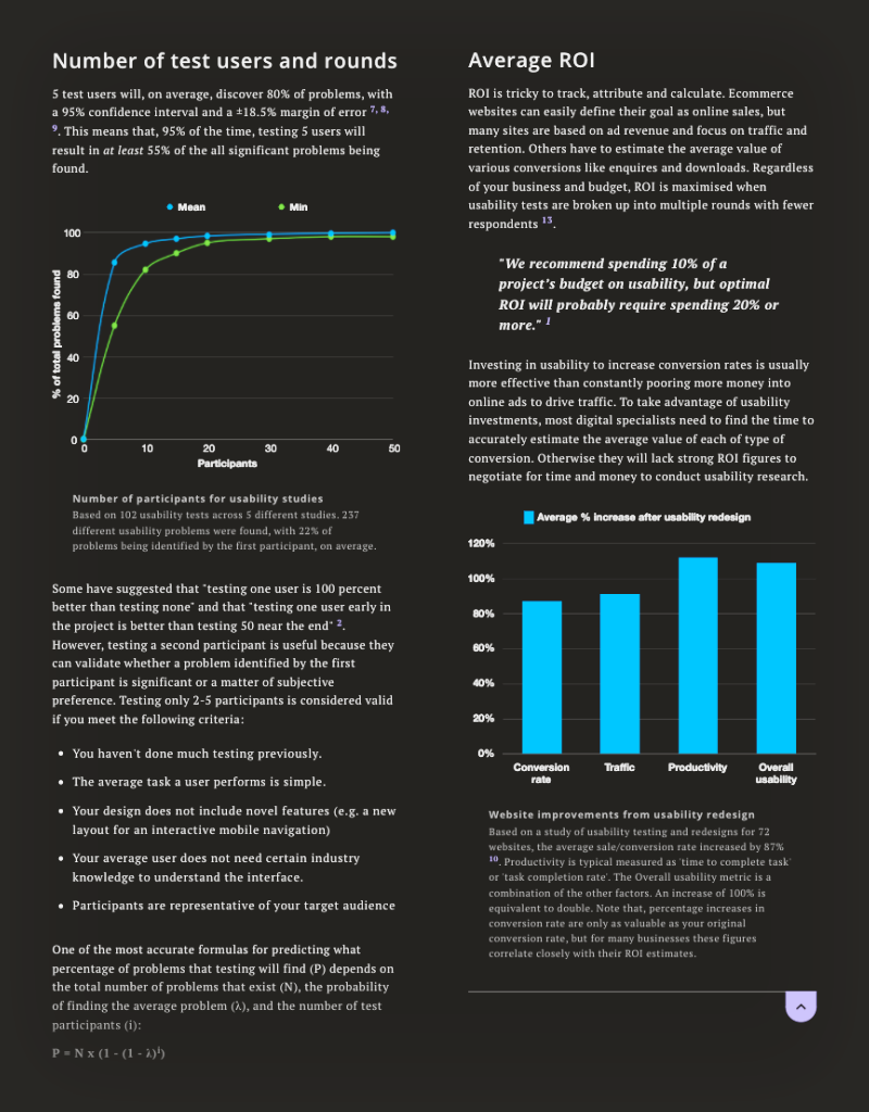
Sceenshot: A sample of one page from the original ~9 page review (before being un-published for updates and re-publication).
Tools: Google Scholar, Google Trends, Excel, Numbers, Adobe Illustrator.
© Hadleigh Waldegrave, 2019
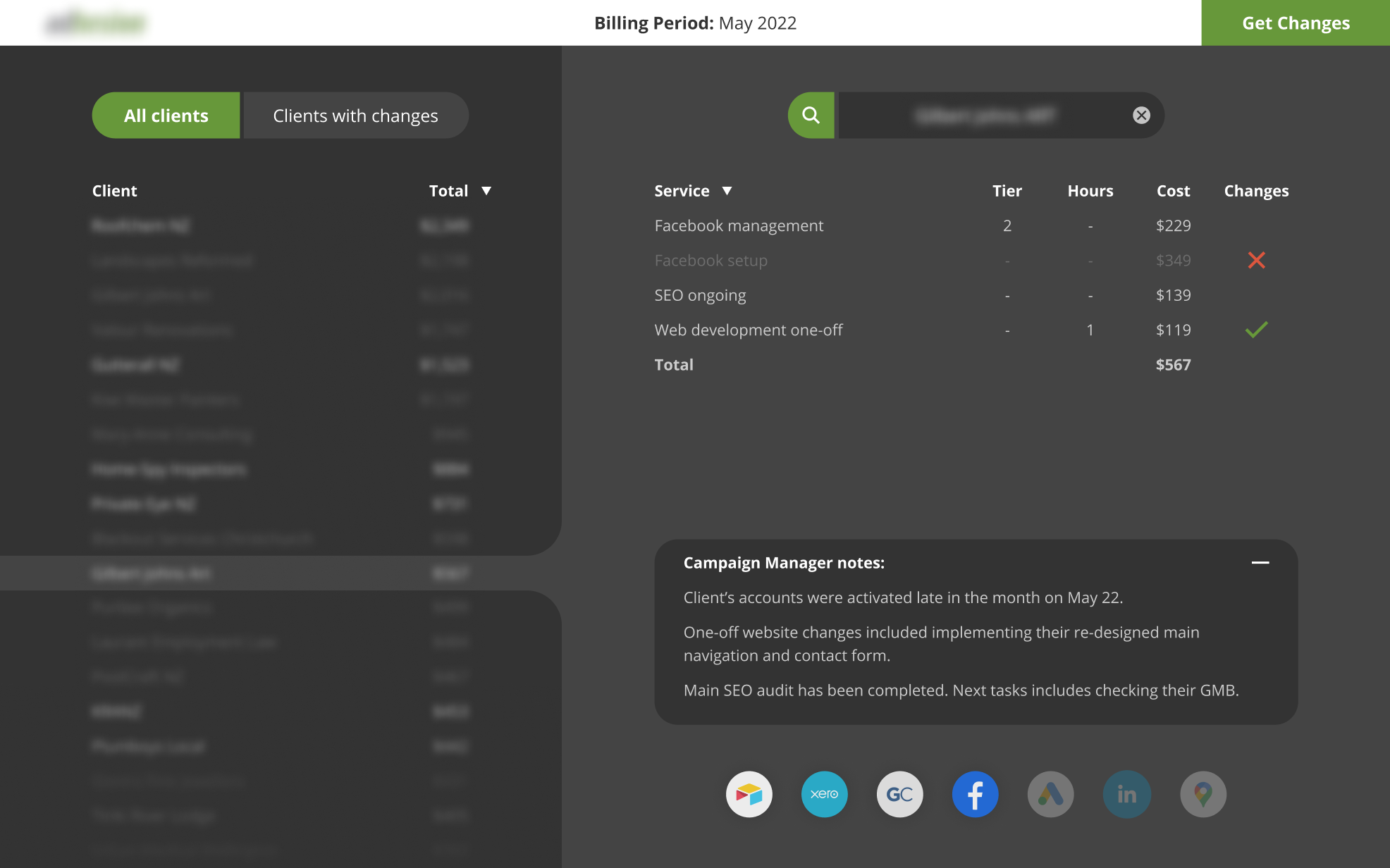
Invoice-automation webapp
I was contracted to manage and execute a project to automate the billing for a business with hundreds of clients. Invoices were templated via Xero but there was a wide variety of clients paying for countless combinations of services and add-ons. The business had to dedicate a significant amount of valuable resources to ensuring each invoice was up-to-date and approved for sending out. For many clients, their spending was adjusted from month to month, and many occasionally started additional services or paused/changed existing ones. The goal was effectively to automate away as much of this overhead as practical.
I started by making a medium-fidelity design (right) for a webapp whose UI would organise data from Xero, GoCardless, Google Analytics, LinkedIn, Facebook and the business' CRM. For such an important project, it was a small price to pay for facilitating clear conversation about the scope and requirements of the backend functionality. Figma was used to conceptualise the UI, which was relatively basic, but provided enough of a visual cue to help work out exactly what information employees would need to see.
Following this, I worked closely with the business owner and lead developer to ensure I met their expectations while planning and developing the bare-bones functionality of the webapp. This included building in authentication for security, integrating live data from various APIs, processing this data through a complex web of logic to handle all kinds of invoices, validating and pushing invoice updates to Xero, and generating a report in the UI to confirm what changes were made.
I'm brushing over a lot of technical and tactical details about how this project was delivered, but it is now used by the business every month to save a lot of time and headache. There is a lot of sensitive information that I can't disclose publicly, but I can provide a lot more details about my involvement if you get in touch with me.
Responsibilities: Project management • Requirement planning • UI prototyping • Webapp development • API integration • Dataset processing • Report visualisation • Technical documentation writing • Handover and training
2022
Componentising and roadmapping a brand refresh
Dovepress needed a design direction that could be used to refresh their platform as a leading journal experience provider, and match their audience's level of digital-savviness. Their team's lack of resource meant that changes would need to be implemented gradually, as the business was ready.
I managed conversations across their head of digital, developer and other specialists to map out why their systems were designed the way they were, and the constraints they faced for making changes. With only 2-months of budget, I had to quickly and thoroughly work out the root problems that needed addressing.
Before the project officially began, I had implemented custom tracking across their site to start accumulating more useful data. After working out what problems we should be focused on, I began conducting deep user-behaviour analysis and gathered qualitative user feedback from Dovepress' marketing team. We determined that the new design language should look and function in a way that fit into their user's daily publication workflows, and the tools they used (e.g. gradually creating work to be submitted over weeks and months).
We designed an array of flexible components that could be used to gradually transform Dovepress' platform, one section at a time, as business resource become available. With the time we had left over, we provided guidance for the order in which they could implement gradually in a way that would make sense for the business and their users. The business now has a design language that they can implement and build on as they're ready.
Responsibilities: Project planning • Custom analytics • Branding • User research analysis • Stakeholder management • Employee interviews • Iterative prototyping • Implementation roadmapping
Tools: Figma • Google Tag Manager • Google Analytics
Slides: An example of the existing site and a collage of responsive design components that were included the roadmap of gradual changes.
© Dove Medical Press Ltd, 2022
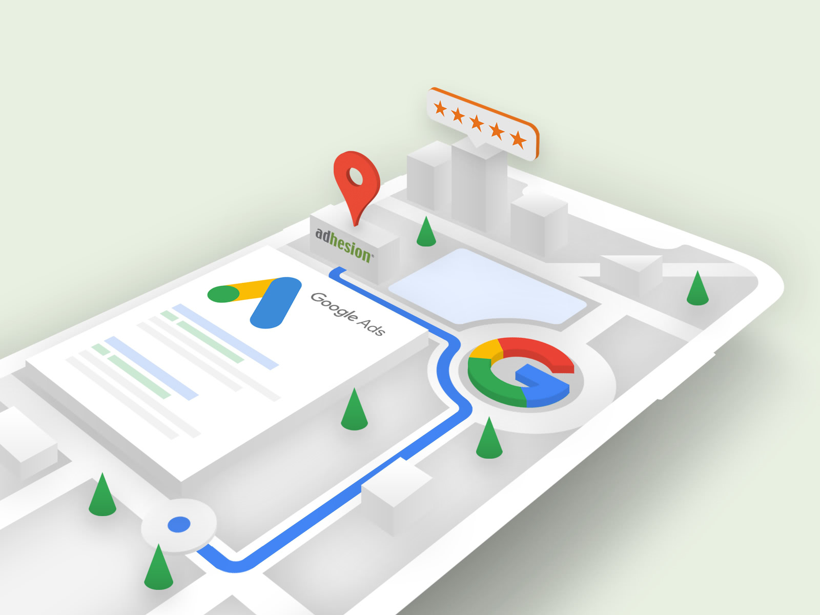
API-integration for custom reporting
Google Data Studio is a popular reporting platform for businesses who find interfaces like Facebook Business Manager and Google Analytics simultaneously too basic and too complicated for reporting purposes. Adhesion provides an array of reports for clients who have engaged in various their various digital marketing services. Unfortunately, this can require paying for expensive 3rd party software (called 'data connectors') to pull and process data from various APIs, and pass the data in compatible formats to Google Data Studio.
To reduce costs and focus on Facebook reporting features that were more relevant to the agency, I was tasked with developing a 'data connector' program that would work across their range of 300+ clients. This involved creating a Facebook application, a Google Cloud project, and a Google Apps Script written in JavaScript.
My program has been tested and implemented, and now allows for employees to create in-depth reports with custom graphs to suit their clients' needs. When an employee creates some graph, my program makes the appropriate API request(s), processes that returned data, and populates their graph with accurate metrics and dimensions. It can handle complicated graphs with several metrics (e.g. Conversion Rate, Revenue, etc), broken down by multiple dimensions (e.g. Month, Campaign Name), filtered by various formulae (e.g. Only custom FB pixel conversions), and sorted by multiple metrics (e.g. highest Revenue first).
I have also been developing 'data connector' programs to provide reporting for clients' Google Maps listings and website down-time status. I love being able to interact with APIs to enable custom functionality and interactive user experiences. I have received much praise about how much more customisable, relevant and enjoyable the agency's reports have become.
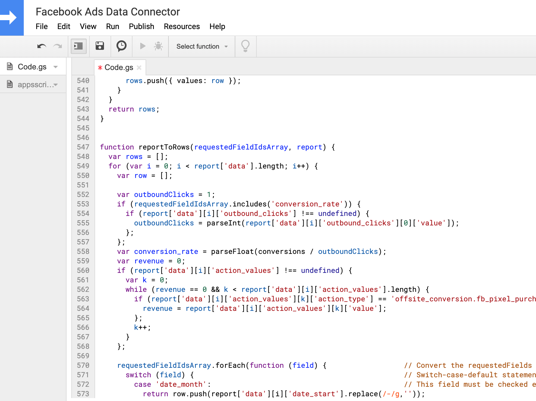
Tools: JavaScript, Google Apps Script, Facebook Marketing API.
© Adhesion, Ltd, 2018.
In-browser and interactive 3D animations
Since 2021, I've started developing skills to bring my 3D assets to the web, using libraries such as three.js and react-three-fibre. This screen recording illustrates one of a few 3D environments I've developed in-browser. My goal has been to interactively animate thousands of objects simultaneously, as efficiently as possible (i.e. without lag/skipping render frames). To do so, I've focused on improving the scalability of the algorithms used to quickly calculate the new position/properties of objects, and achieving a desired 'look' with minimalistic lighting, filters and processing layers.
In this case, as the user scrolls (or moves their mouse), the algorithms update a few variables used to adjust an array of objects' positions/properties. To keep things efficient, I went through the algorithms and the environmental data to factor out as many constants and semi-constant variables as possible.
I look forward to developing my skills with web-based 3D animation. I know I still have a lot to learn, especially as the development and adoption of 3D libraries (and subsequent techniques) accelerate.
© Hadleigh Waldegrave 2021
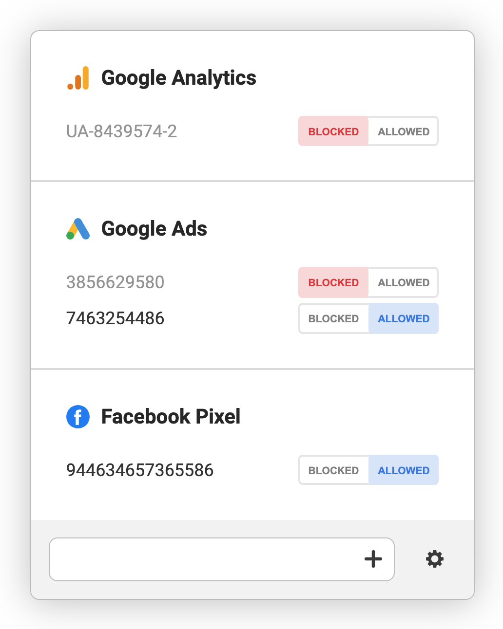
Chrome extension design & development
The problem: Many digital specialists frequently visit websites they are working on, but do not exclude themselves from installed tracking software (e.g. Google Analytics, Hotjar). This is usually because they are not aware of how significantly they are skewing their metrics, and/or because this requires manual work for each website and platform.
The solution: Many Chrome Extensions are gimmicky, but the right ones can be very useful. In this case, an extension provides an efficent way for digital specialists to exclude themselves from installed analytics software on the fly. By leveraging Google's webRequest API, we can intercept any tracking software from sending data to specified servers (e.g. LinkedIn, CrazyEgg).
To make this solution as user-friendly as possible, I used Figma for a design sprint of the extension's UI and, later, a prototype of the extension's user flow. Feel free to play with the UI using this Chrome Extension demo I developed. After a lot of exploring user personas and scenarios, I landed on a design that would allow users to block/allow relevant analytics trackers, and enter/save tracking tags manaually.
I developed a way for the extension to display tracking scripts that it detected automatically, as well as tracking tags that a user had saved. I also developed a UI mechanism that automatically detected the type of tag a user enters, to remove the step of having to selecting it manually, as well as messages to give to the user relevant feedback and prompts.

Tools: Figma, JavaScript, Google Chrome Platform, WebRequest API, Storage API.
© Hadleigh Waldegrave
Transparency design with Sketch
I like to be flexible by mixing up my use of tools like Sketch, Photoshop and Illustrator — and my current goal is to develop my proficiency with Figma. I generally prefer to use Photoshop and Illustrator because they simply have more powerful features. However, Sketch is great for conceptualising digital experiences that often need design ammendments everytime you get feedback.
One of the examples in the slider shows a cascade of brochures generated by a template designed in Sketch. The brochures were designed to provide a very transparent and straightforward onboarding experience for customers (especially compared to that of competitors). There was a lot of discussion about the content, which required a lot of variants to be designed quickly between multiple people.
The other Sketch example shows some of the website redesign work I did for Compass. The redesign was to better communicate their Unique Selling Points (USPs) as a means of improving conversion rates.
Both of these examples required design decisions that focused less on looking simple, and more on feeling transparent. I'm always keen and ready to explain design decisions, to integrate feedback, and to learn from fellow designers.

Tools: Sketch, Google Drive.
© Adhesion, Ltd.
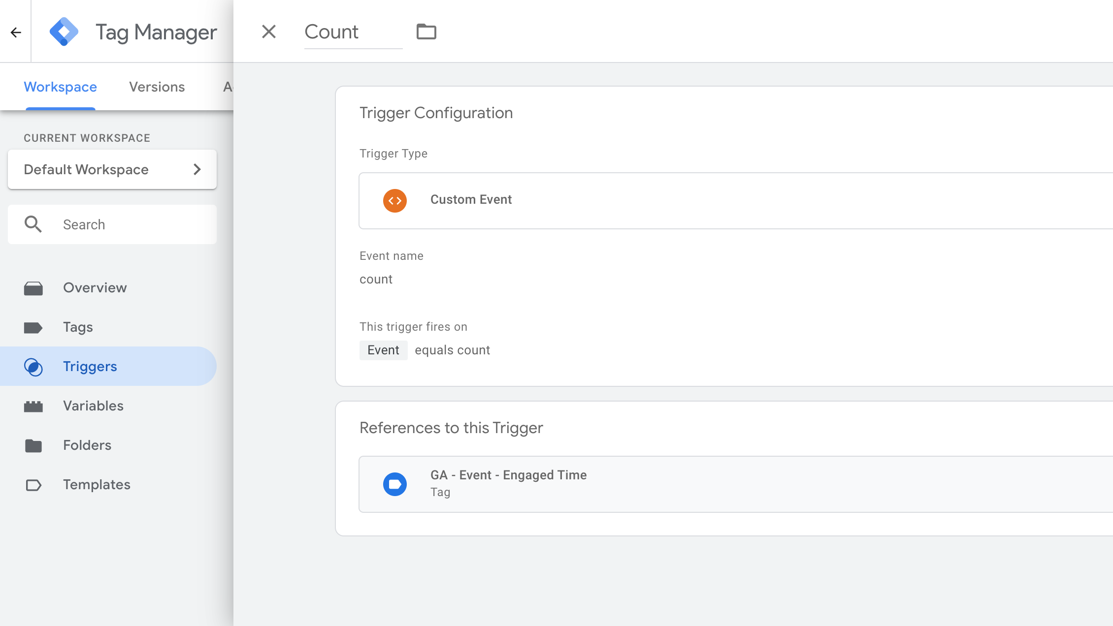
Custom metrics for analysis
Google Analytics provides a 'Time On Page' metric, but it isn't very insightful because users can leave their computer open on a page without looking at it. At the time, Adhesion was going to launch a new website, which prompted the idea of developing a script to accurately record 'Engaged Time On Page'.
This required writing some JavaScript that recorded how long users were engaged with the page and stored the information in a data layer object. Put simply, the information in the data layer is sent via Google Tag Manager (GTM) to Google Analytics.
We also used GTM to implement tracking for users' scrolling behaviour. Integrating these data, we were able to more accurately determine which pages people spent more or less time reading, and what types of pages should be more concise or elaborate. Of course, no solution is perfect, and we know not to use this data as an absolute measure for engagement, but it is more accurate as a relative measure for comparing pages to one another.
Although I had used JavaScript before for manipulating elements on websites (e.g. sliders, drawers, collapsable menus, etc), this project sparked my interest in learning Javascript from resources like javascript.info. I'm especially interested in developing these skills for UX design/research and webapp development.

Tools: JavaScript, Brackets (code editor), Google Tag Manager, Google Analytics.
© Adhesion, Ltd.
User testing & iterative design
In response to increased competition, the Extreme Edge rock climbing centre had been investing in modern equipment and updating its branding, but its site was out-of-date. A lot needed to change, and many website visitors are new customers, so I focused on UX research.
Having learned a lot about Extreme Edge's operations and customers various experiences, I narrowed down my user personas to motivated first-timers, casual repeat customers, dedicated members, and parent for kids' birthday parties. I then applied Steve Krug's 3rd law of usability to the website's copy: Half the number of words, then half it again. This resulted in a list of informative bullet points from which I began defining the information architecture (IA).
I used this IA to construct a medium-fidelity wireframe, then began scenario testing with 5 people to represent the different personas. A disclaimer about low sample size: As a setter for Extreme Edge (i.e. someone who creates new climbs), this was an initiative I took upon myself in good faith. Budget was almost non-existent, so I personally funded this research. As they say: "One test is better than none" and this research gave me more than enough to go off, for the time being. Many of my findings helped refine microcopy to reduce the ambiguity of Extreme Edge's various gear and supervision requirements.
I also asked a number of staff about the business' priorities, and began designing a high-fidelity prototype. During this process, I took long breaks away from my designs to read UX books/articles and return with a more fresh perspective. A few more usability tests focused on solving the remaining conflicts between users' needs and the website's semi-modular design. It was always important that the design could be developed in a way that staff could use a CMS to refine pages and update content/prices.
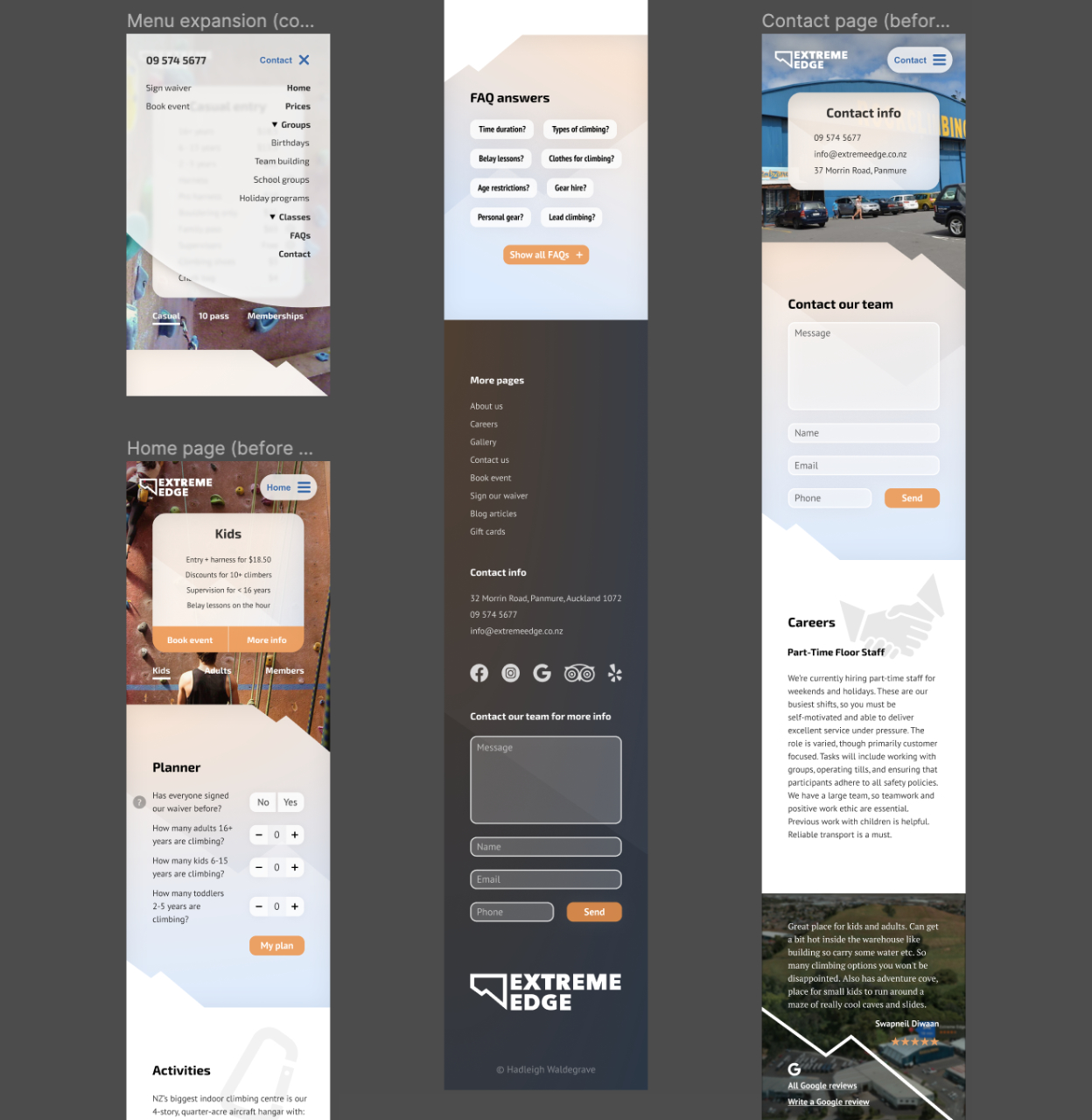
Tools: Figma, Google Forms, Google Analytics.
2019
3D animated ring box
I made a ringbox for a friend that I go rock-climbing with. The design had to be travel-friendly and theft-proof, yet easily-accessible (if you know how). This render (right) illustrates my 3rd design iteration, featuring 2 gravity-fed steel pins which lock the twisting mechanism. When turned upside-down, these pins retract into the top chamber, allowing the bottom half to be twisted off. The pendant loop on the top is used to tether the ringbox to a bag (by kevlar cord), with gravity causing it to dangle upright (and therefore locked).
Everything you see here was designed to the exact tollerances of standard materials that I frequently use, including the angle and pitch of the bolt's thread (i.e. the 'screw'). The ring-compartment was carefully sized to fit up to 3 rings, including most small wedding bands and large engagement/signet rings. To test myself, I realisticlly generated the wooden material using node-algorithms (not image-based textures).
Software tools, APIs and browser-support for 3D media are starting to accelerate, so I began teaching myself how to use tools like Blender back in 2019. There are many applications for 3D animated objects and realistic digital environments that are starting to become viable, due to advancements in algorithm efficiency and computing power. I also enjoy using my digital interests to improve my real-life workflows, including for build-planning. In some cases, it's easier to identify problems with relatively complex 3D concepts when I'm not restricted to designing in 2D only).
© Hadleigh Waldegrave 2021
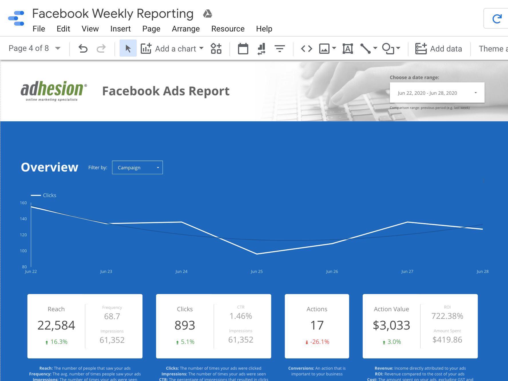
Report template design
When onboarding clients, they were very keen to know that my team could prove a positive return on investment. However, for various reasons, clients have historically ignored most reports, even though they are highly demanded. My team spent a lot of time discussing how we could make the reporting experience more enjoyable and easier to understand, especially for people who may struggle to interpret graphs.
What KPIs need to be in our client's reports? What insights do we prioritise? What's the easiest way for client to access reports when it suits them? The result was this design for our reporting template, split into website, SEO and advertising sections. Using Google Data Studio's open-source data connectors, we were able to integrate data from various platforms, from Google Analytics, to Search Console, to Facebook, and more. Data Studio also allowed our design to be interactive with dropdowns for filtering properties like time period, device type, campaign, location, etc.
Our design process included testing concepts on a sample of our clients, discussing feedback about their needs, and itterating the design. We knew a one-size-fits-all approach would be too idealistic, but we ended up with a template that we could easily use to enable/disable specific elements based on specific clients' needs. We received good feedback about the improved reports and more clients engage with them.
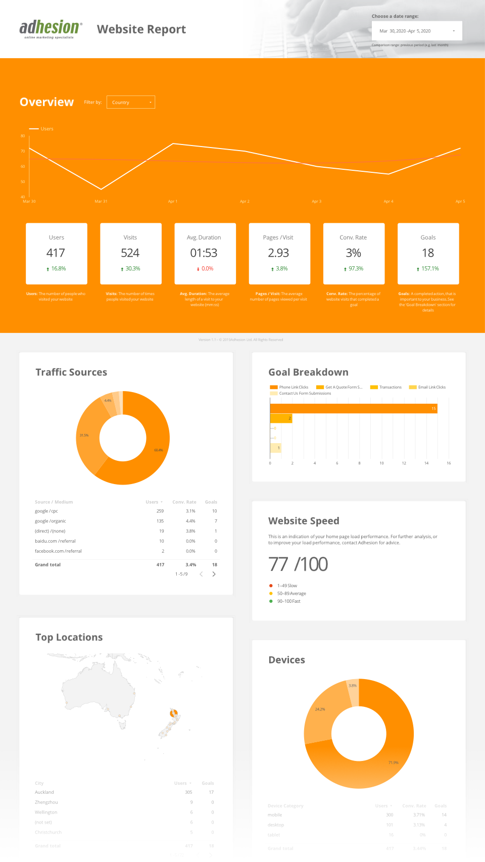
Tools: Photoshop, Sketch, Google Data Studio, Google Analytics.
© Adhesion, Ltd.
Web Scraping with Python and JS
This was the first stage of a large project: collecting design-related data about Adhesion's site; processing and joining this data with user behaviour data from Google Analytics' Reporting API; performing statistical analysis to determine which design factors affect user behaviour; and visualising the findings with interactive graphs on my Flask/SQLAlchemy webapp.
The web scraping was automated by writing a Python program which found all the sitemaps of a domain (e.g. adhesion.co.nz) and extracted a list of relevant URLs. With permission (and restrictions to prevent flooding the server), my program then retrieved webpages and their assets, and injected scripts to extract data about various design elements. This data is being joined with user behaviour data from Google Analytics.
Once I have performed a bunch of statistical analysis, I will push all my data to a cloud database, from which my webapp will request data to visualise online.
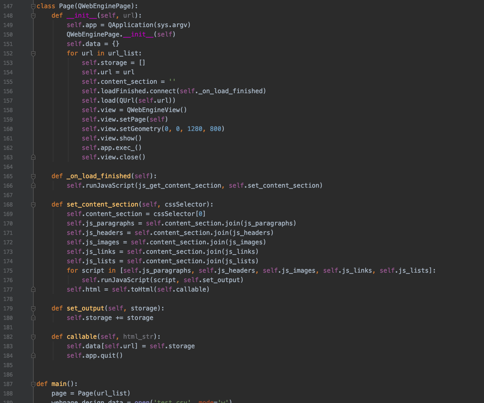
Tools: PyCharm, Python, Flask, JavaScript, SPSS.
© Hadleigh Waldegrave
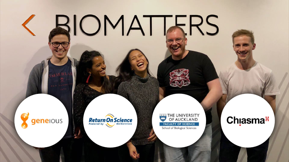
International Genetic Engineering Competition (iGEM)
Established in 2003 by MIT graduates, iGEM is a global platform for inventing and collaborating on genetic mechanisms. Our biotech group, Mod, aimed to develop plants with improved fertiliser uptake and metabolism. This would reduce pollution from our agriculture industry, reduce fertiliser costs for farmers and growers, and increase pasture growth rates/yields. You can learn more in our full Genetics Project Presentation.
I lead our team for 12-18 months and was ultimately accountable for everything from recruiting and growing a cohesive team, to managing relationships with stakeholders, project roadmapping and risk management, commercialisation plans and fundraising, and training and facilitating collaboration between individuals.
Mod helped provide science students with a mix of real lab and commercial experience. When we weren't in the lab, we were involved with community engagement, presentations and innovation advocacy initiatives.
We were on track to have a proof of concept plant by the end of 2018, and had detailed plans to improve the plant further during 2019. We had built a comprehensive business case but, in the end, we did not secure enough funding to further the project. Our team learned a lot about the financial, legal, technical and ethical aspects of bringing new technologies out of the lab. It was definitely worth all the effort we put in.
Tools: Excel, RStudio, Google Scholar, Pages, Photoshop, Keynote, Powerpoint.
© Hadleigh Waldegrave
Graphic design for SEO
High-quality, original imagery influences people's perceptions as well as SEO performance. This graphic visually communicates the ideas in one of Adhesion's popular articles: Do Google Ads work for small businesses?
Google's algorithms know what content is original, and they reward websites that are authentic, trustworthy and engaging. They also penalise websites that are poorly optimsed, which is why I carefully tag, size and compress my design works.
These semi-3D grahpics are a small sample of several dozen original pieces I designed as part of an initiative to boost SEO and inspire quality content creation.
Tools: Photoshop, Illustrator, Figma, JavaScript, ImageOptim.
© Adhesion, Ltd.
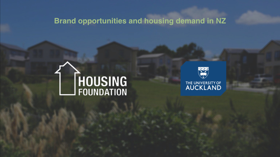
Market research and presentation
1st place award for best market research (out of ~30 competing submissions)
This was a 'live' project for the final-stage Advanced Market Research course at the University of Auckland, in association with the NZ Housing Foundation. We were in charge of planning and executing our own research for understanding how the NZ Housing Foundation could improve their services and strategically expand their market segments. This presentation of our work (right) was animated to help articulate key insights we based our strategy recommendations on (the animation is not available in this PDF).
Having carefully collected perceptions from a sample of 700 people from their target population, we used a range of statistical analysis tools to clean and mine the data to find insights. I was tasked with designing my team's presentation, and we shared our findings with a committee of experts from NZ's marketing industry and executives from the NZ Housing Foundation. Feel free to view our full Animated Market Research Presentation. Note that every element was sized and contrasted so they were legible when projected in a large theatre (i.e. it may lack contrast on your device).
Tools: SPSS, RStudio, Python, Excel, Numbers, Powerpoint, Keynote, Photoshop.
© Hadleigh Waldegrave
Article writing and blog development
+41% new blog visitors, +83% leads from blog
I helped execute a strategic initiative to revamp Adhesion's blog section. Increasing the quantity and quality of our articles did wonders for SEO and traffic. On top of that, by publishing our business' knowledge and expertise online for free, the Adhesion brand has become known as trustworthy and transparent.
I've spent a lot of time carefully researching and writing over a dozen articles for Adhesion. Feel free to look over some examples of my writing work:
Tools: Pages, Microsoft Word, Google Drive, Craft CMS, Twig (templating language).
© Adhesion, Ltd.
HTML5 design
I have developed many HTML5 files for various purposes including advertising on platforms like Google Ads.
Users appreciate the subtle animation and blurring as a means of improving engagement and adding visual depth, without being distracting and 'pushy'. Everything including the forest, animation, copy and the render of the machine was designed to reflect the premium quality of Illumina's high-tech products.
Multiple calls-to-action were included with carefully-chosen wording so users knew exactly what they could get on the landing page (this example only shows one version).
Tools: Brackets (code editor), HTML5, CSS Animation, Photoshop, Google Ads.
© Illumina, Inc.
Designing for multiple conflicting objectives
I designed this entertainment unit to meet a variety of criteria: Provide adequate long-term storage; Disincentivise the accumulation of short-term clutter; Provide plenty of space for cable management; Passively dissipate a lot of heat; Accommodate a variety of large devices of different shapes; Look aesthetically-pleasing with (and without) key devices; Maximise size-to-storage-volume and strength-to-weight ratios simultaneously.
I acquired a new soundbar, subuwoofer, tv and gaming console, so I knew most of the dimensions I needed to accommodate. After several design iterrations, I got inspiration from the devices I was attempting to integrating. The most obvious example is the 'heat-fin' style panels, which reflect the PS5's casing and GPU. Another is the 'cut-outs' in the front/middle of the design, which gave the subwoofer a direct contact with the floor (important for acoustics). This arrangement with the soundbar largely determined the width and height of the unit.
Having worked out the external shape, the rest of the design centered around: maximising internal space while being able to support 100kg without flexing; allowing for shelves to be slotted in and adjusted on an as-needed basis (not shown in this render); incorporating a steel frame that would provide magnetism for the front panels to pop on and off; minimising material costs and build time while requiring no industrial/automatic machines to build (i.e. I wanted to use hand-tools only).
This is the most useful and praised piece I have built to date. I doesn't accumulate clutter because it has not real flat surface for small things, and it's easy to de-dust both inside and out with my little battery-powered blower. Overall, I'm really pleased with overcoming so many interconnected design and process problems.
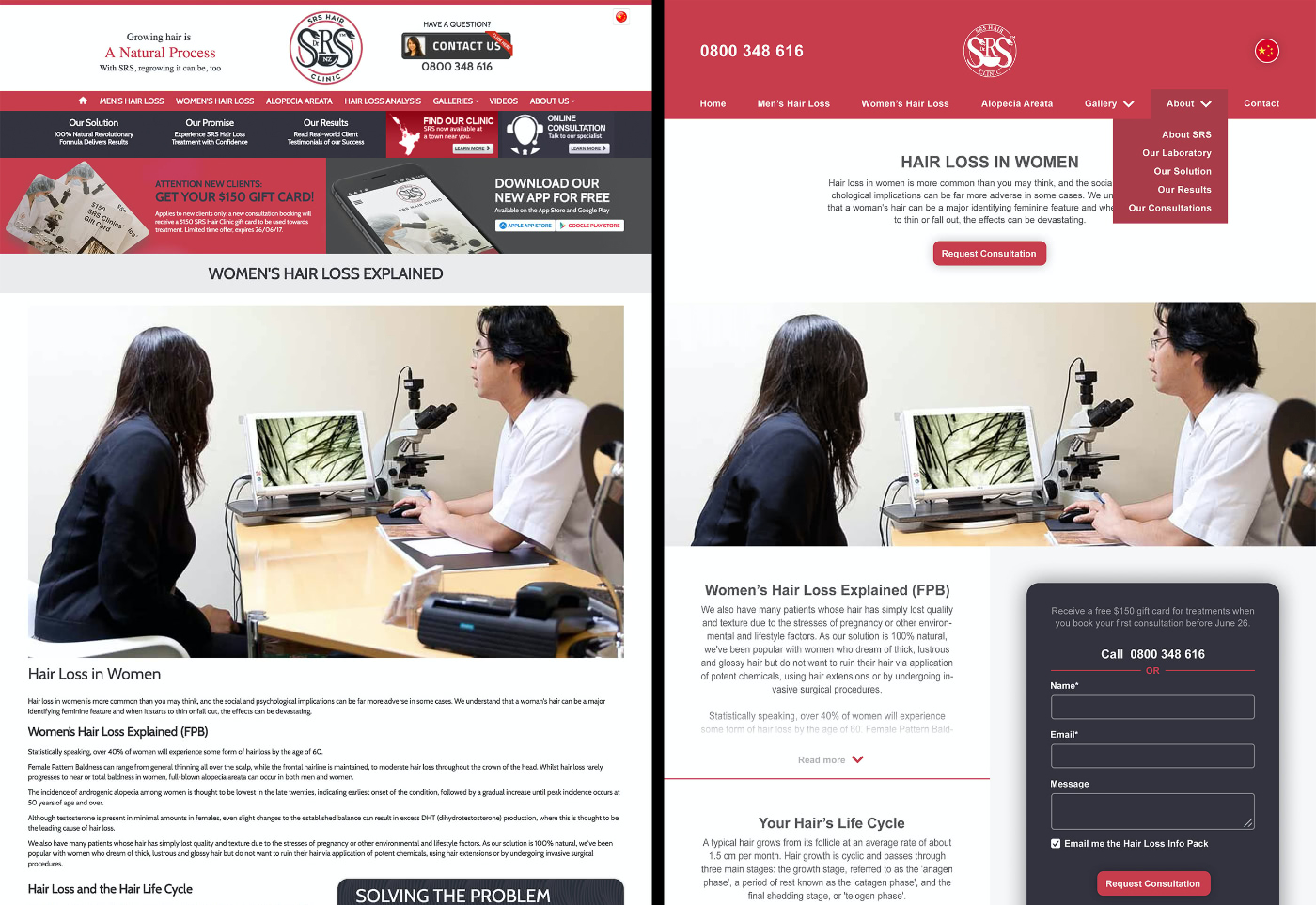
Web design and form optimisation
This client was spending on online advertising but few visitors were converting. As part of our work for them, I provided them a re-designed of their website for CRO, including this online form. The image slider exhibits the before-and-afters.
It features a limited-time incentive, fewer fields to fill out, more-balanced white spacing, security and privacy guarantees, and more. The 'Message' field has been moved to the top, with an 0800-number for those who don't like to give their email away. As usual, there were many restrictions in the design brief, but the client was happy and went forward with updating their site.
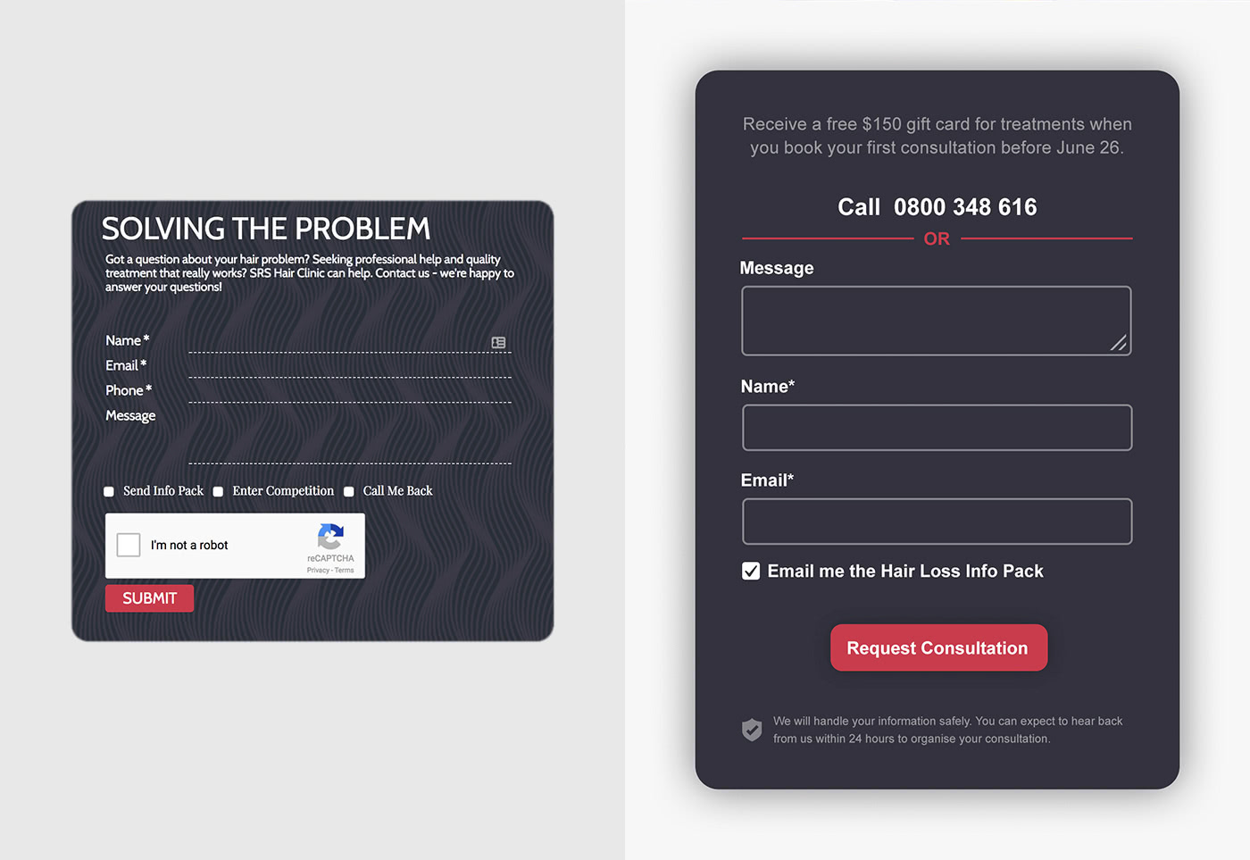
Tools: Sketch, Photoshop, Wordpress.
© Adhesion, Ltd.
Business strategy research project
MYOB award for best innovative strategy
Advanced Market Strategy is a capstone course at the University of Auckland. The course was a 'live' project in association with Contiki and a few other businesses, including MYOB. It required us to apply everything we had learned as marketing majors.
My team's full Contiki Strategy Report focuses on the organisation being entrenched in its traditional offering, and the increasing threat of independent travellers trading bus tours for shared Autonomous Electric Vehicals (AEVs).
We analysed product reviews, competitor activities, demand distributions, market opportunities and threats, internal and external risks, brand positioning, target demographics, pricing options, sales forecasts, and more.
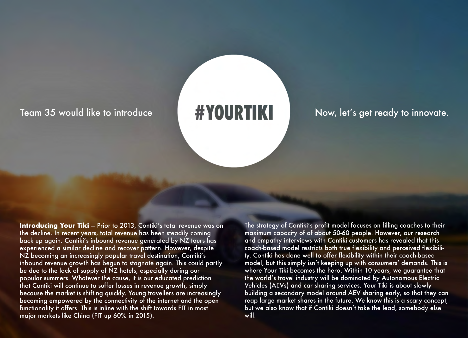
Tools: Excel, Pages, Photoshop, Powerpoint.
© Hadleigh Waldegrave
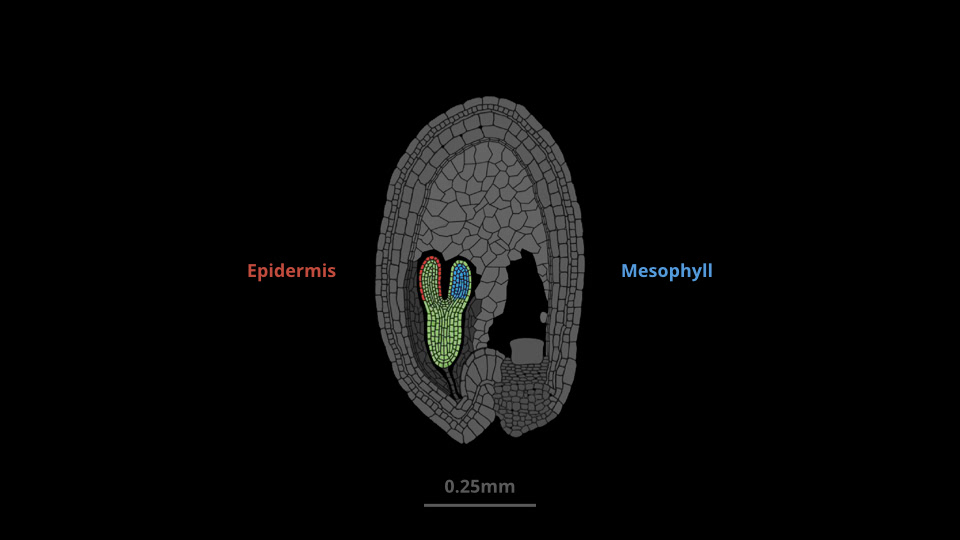
Bioinformatics research and presentation
1st place presentation (peer reviewed)
This final-stage bioinformatics project required each student to review published research on gene expression. I focused on the characterisation of specific cell types in plant embryos to understand how the expression of genes differed between mesophyll and epidermal cells. My presentation (right) only consisted of 8 slides because it was highly animated to help visualise the complexities of the study I reviewed.
The overall focus was to use best-practice bioinformatic techniques to verify whether or not the findings in the published research were accurate. In the end, I found and corrected a number of errors and invalid assumptions made by the original authors.
The results of my analysis using tools like RStudio, Python and Excel can be viewed in my full Bioinformatics Project Presentation and Bioinformatics Reseach Report.
Tools: RStudio, Python, Excel, Powerpoint, Keynote, Photoshop.
© Hadleigh Waldegrave
Problem-solving using alternative media
I built this shelf during the pandemic/lockdown, when many materials (especially wood) were extremely expensive and unavailable. The goal was to use this limitation as a source of inspiration. While looking for a material/structure that required little wood, I began researching examples of tension-based design.
This process was very uncomfortable to me because I didn't have the skills to use physics engines to realistically model how tension would cause the materials to flex. So, I designed this concept with less-accurate tollerances, knowing that I would have to test and measure its flexibility as I went.
I used kevlar for the black cord, because it was relatively inexpensive, lightweight and has 5~8 times the tensile strength of steel. I designed an adjustable mechanism in the shelves that would allow me to friction-lock each cord (where the cord passes through the small holes in each shelf). This was important for the process of gradually tensioning the shelves into the correct/level shape.
Its rigidity and weight-to-strength ratio is remarkable. It's been tested up to 60kg (20kg in the middle of each shelf). Part of its dynamic strength comes from the pattern of the cords. Each cord provides alternating support to the front of one shelf, and then the back of the next shelf. This means that, as weight is applied to the front of one shelf, the back of the next shelf is pulled down. In other words, pushing the front of one shelf down raises the front of the shelf next to it, providing it additional tension to support more weight and remain relatively level.
© Hadleigh Waldegrave 2021